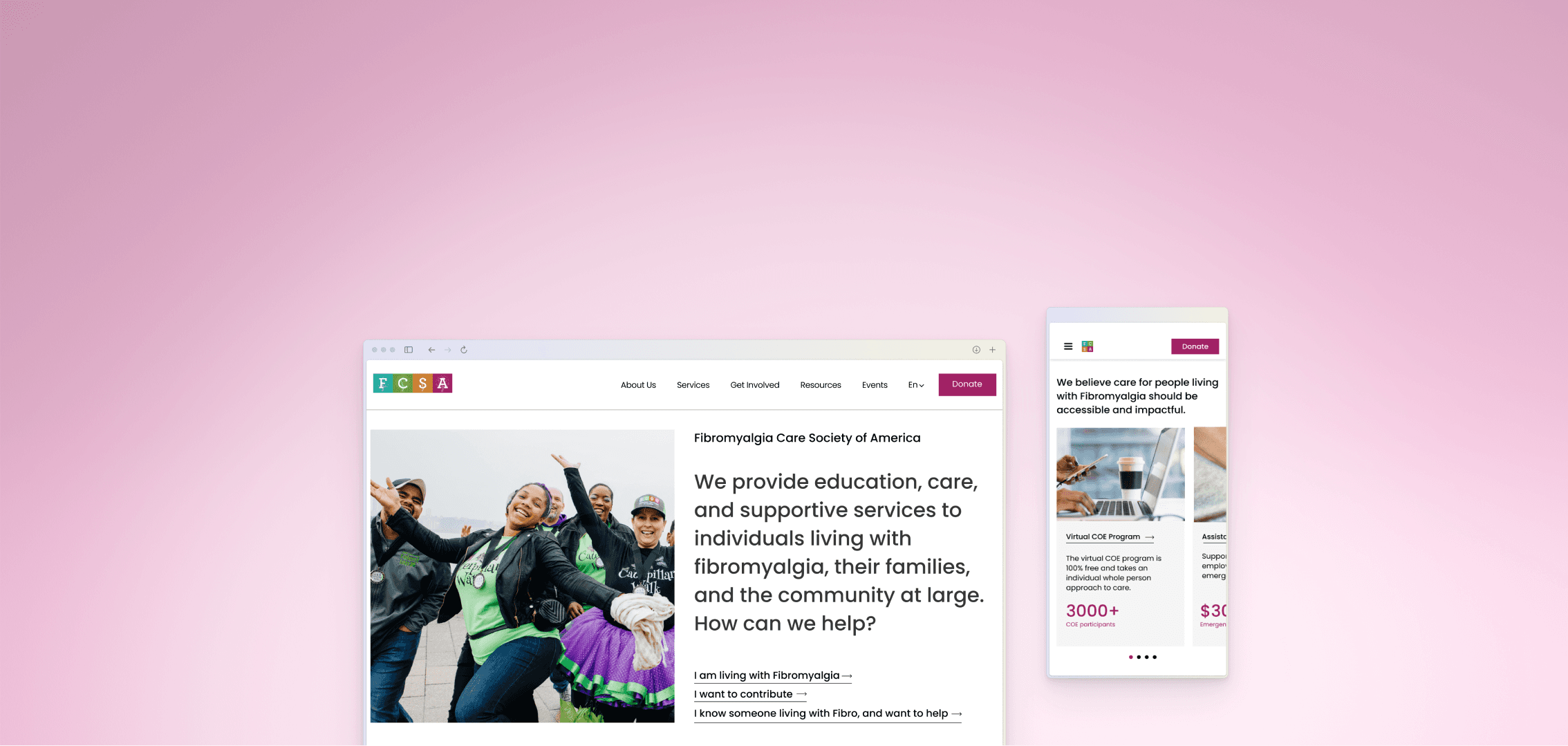
Overview
The Fibromyalgia Care Society of America (FCSA) provides support to individuals with Fibromyalgia, a chronic condition causing pain and cognitive difficulties. The non-profit approached us to redesign their website for compliance to the Web Content Accessibility Guidelines (WCAG).
Our redesign involved product and user research, resulting in an end-to-end responsive solution for their website, going beyond enhancing accessibility.
Team
4 UX Designers
Project Duration
January 2023 - April 2023
Tools
Figma, Google Sheets, Notion,
WAVE Accessibility Tool
The Problem
Poor accessibility and usability issues caused hinderances on key areas of the website for users with Fibro.
The Solution
A website redesign improved accessibility and community engagement, focusing on information architecture and visual design.
30%
Improvement in WCAG compliance.
Improved adhereance to the Web Content Accessibility Guidelines 2.1
25%
Increase in efficiency of user flows.
Decreased time to reach call-to-actions for key areas.
50%
Reduction in redundancies with style guide.
Streamlining style guide for consistency across the website.
The Design Process
A Double Diamond approach.
While keeping the goal of enhancing accessibility, we approached the project using the Double Diamond process.
Area of Focus
Incorporating Accessibility Early On..
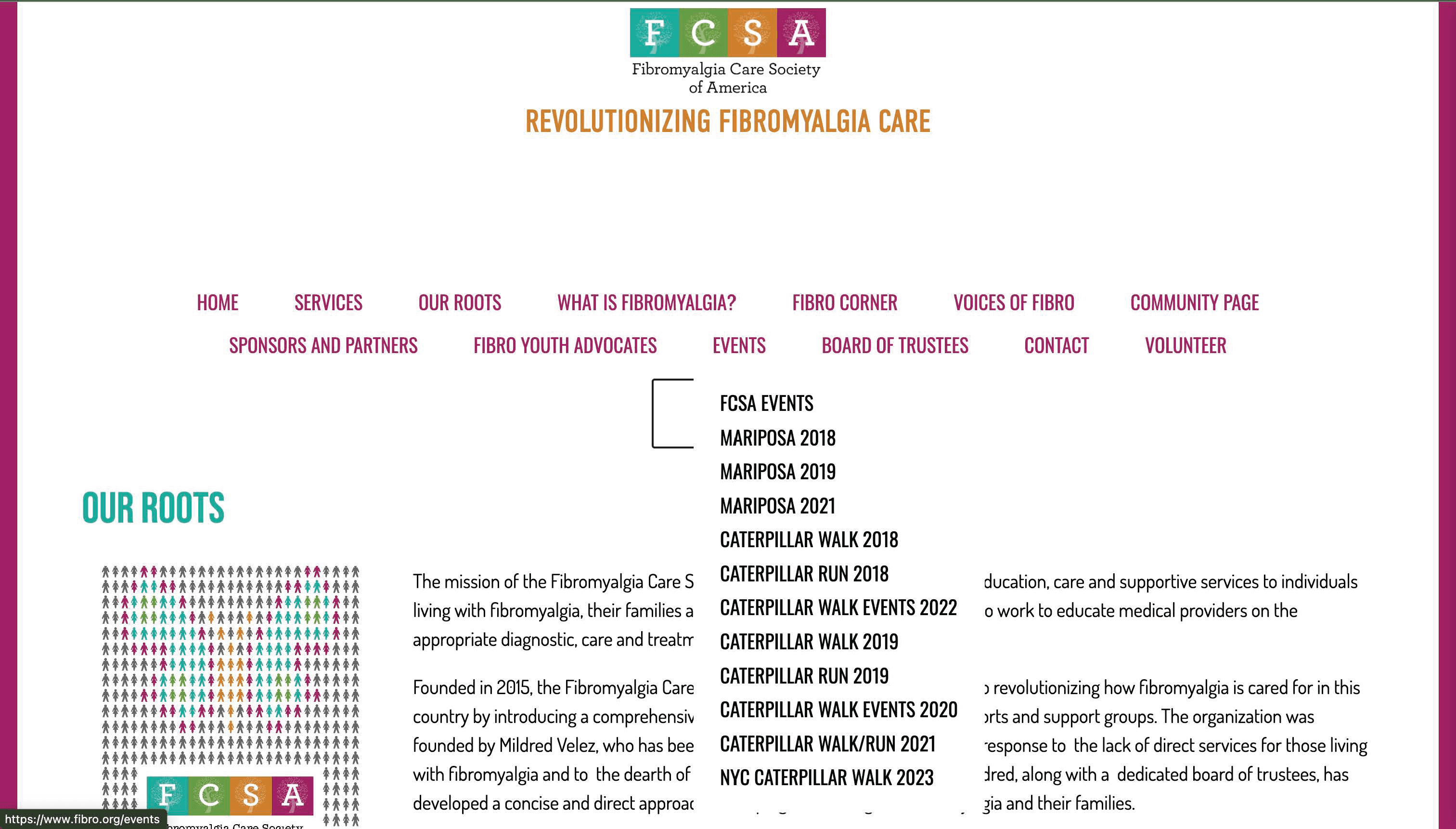
Our early research consisted of an accessibility audit using the WAVE Evaluation Tool, intending to incorporate accessibility as a foundational principle. The audit uncovered the following areas where compliance could be enhanced, which we kept in mind for future design decisions:
Image Perception
Ensuring images have text-alternatives
WCAG 1.1.1 Level A
Offering text for images that contain information.
WCAG 1.4.5 Level AA
Text says “Can you read me?”
can you read me?
Sufficient contrast ratio
Ensuring a contrast ratio of 4.5:1
WCAG 1.4.3 Level AA
Click here to go there (!?)
Descriptive Labels
Headings and labels describe topic or purpose.
WCAG 2.4.6 Level AA
Consistent Navigation.
Navigational mechanisms are consistent.
WCAG 3.2.3 Level AA
Responsive design
Content can be presented without loss of information or functionality.
WCAG 1.4.10 Level AA
Product Research
We created an ecosystem map to understand the organization and its users.
We gained a deeper understanding of the organization through mapping services and user touch-points.
Product and user ecosystem.

Step 1: Identifying user touch points.
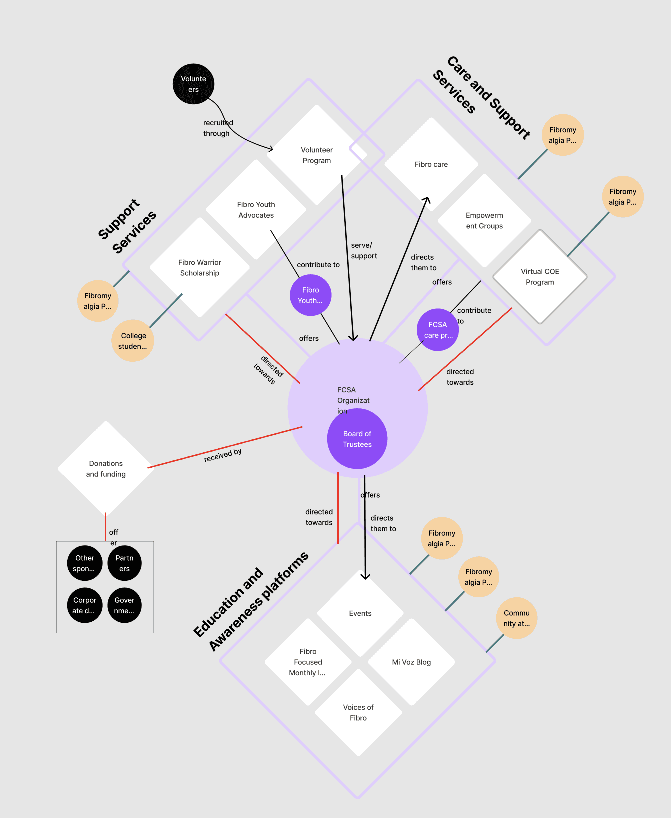
Step 2: Grouping users and establishing relationships.
This helped us identify key areas of the FCSA. The website acts as a point of contact for users to to access these areas.
*
Volunteering and Donations
These functions touch people with Fibro and the broader community.
*
Care and Support Services
Services are the most important touchpoint between the FCSA and people with Fibro.
*
Educational Resources
Blogs and events are an important way to spread awareness among the community.
User Research
We conducted interviews and usability studies involving three individuals living with Fibro on the key areas identified.
To gain a deeper understanding of the needs of users with fibromyalgia, we reached out to three members of the FCSA community. We structured our user interviews and usability studies around the key areas identified. Additionally, we organized our findings by creating an affinity diagram.
Conducting a usability test as moderator.
Volunteer
"Look for volunteering opportunities"
Fibro Cares
Events

Here's what we found..
Finding 01
Users faced challenges in accessing key areas due to complex navigational structure.
Users were unable to complete tasks for 3/6 user flows for key areas. We identified 8 usability issues related to information architecture and navigation.

"There’s Fibro fog and pain - we don’t have time for a lot, so it would be nice to have direct information"
- Study participants thoughts on the homepage.
Inconsistent homepage navigation confused users.
Complex navigation and unclear labels made way finding difficult.
Ideation 01
Making information easy to understand and navigate.
With our accessibility guidelines in mind, we redesigned the information architecture to be predictable, consistent and understandable. We made the following key changes:
*
Easy access to key areas.
Streamlining user flows for easy access to key areas.
*
Simplified navigation.
Fewer navigation categories on a consistent global navigation.
*
Renaming categories.
Descriptive labels for categories enusring understandability.
Proposed Information Architecture
Finding 02
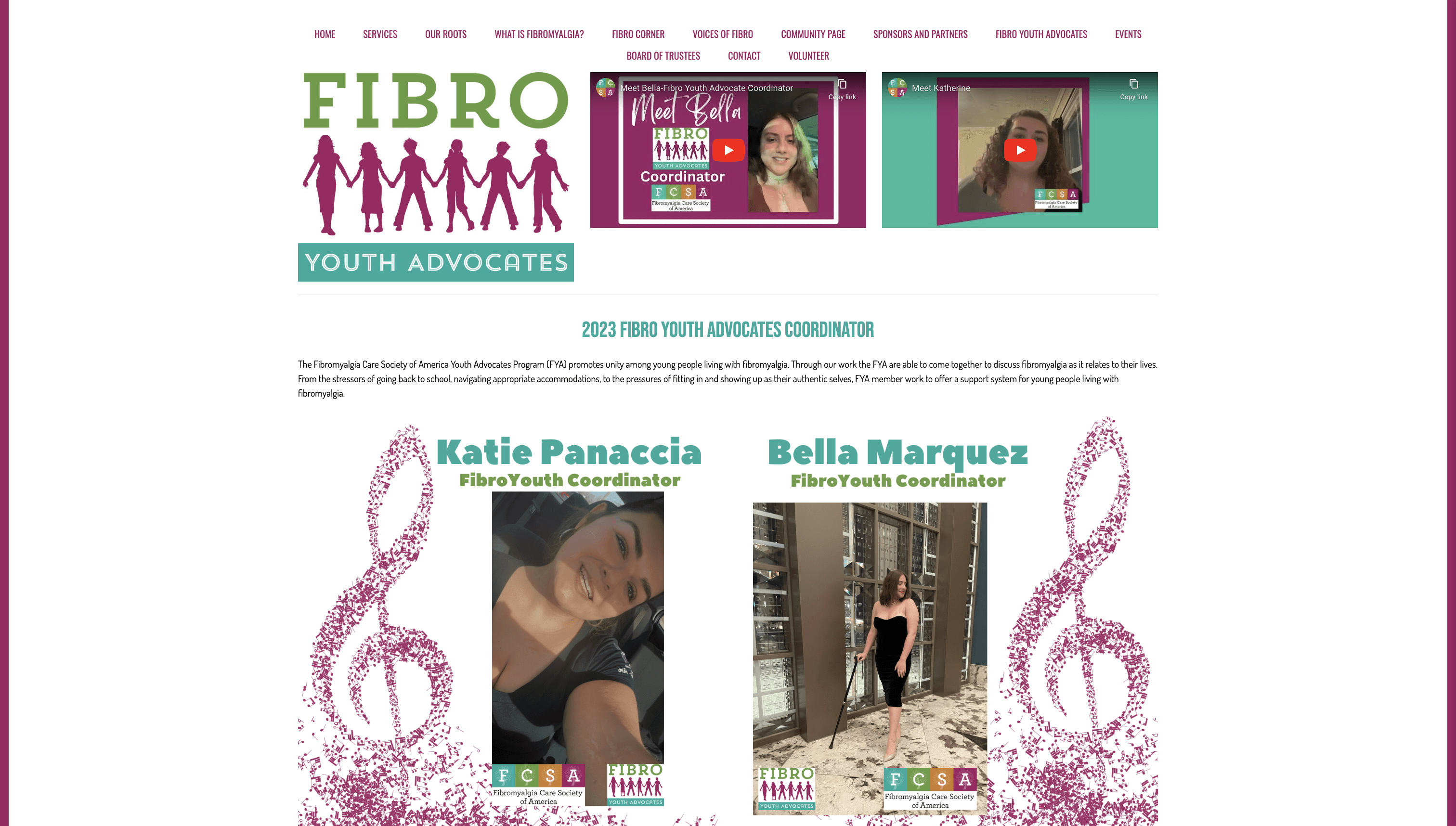
Users were overwhelmed by the visual design, keeping them from fulfilling tasks on the website.
3/3 users expressed frustration and confusion across tasks due to visual design issues.

"I have a sensory processing disorder, small graphic changes make a big difference to us"
- Study participant on website's visual design.
Users were overwhelmed by use of colors.
Long walls of text make it difficult to read information.
Ideation 02
Keeping it simple with the style guide.
The style guide was redesigned to avoid visual overload for users with Fibro. The key design changes we made were:
*
Simplified color and font library.
Streamlined colors and fonts to ensure consistency across website.
*
Maintaining contrast.
Ensuring that our chosen colors met accessibility standards for contrast.
*
Readable typography.
Choosing a simple sans-serif font and defining heading levels for content separation.
Proposed style guide.
Existing style guide.
Finding 03
Users prioritized being connected to the Fibro community through the FCSA.
Users mentioned being able to connect to the Fibro community through events, blogs and volunteering.


"Blogs and events help us stay connected to the community"
- Study participant.
Opportunity
However, the website design presented an opportunity for further enhancing community connection among users with Fibro.
This lack of opportunity to engage with the community through the website is apparent in the absence of clear prompts for action, compelling sections that leave a lasting impression, and visual elements that evoke resonance.
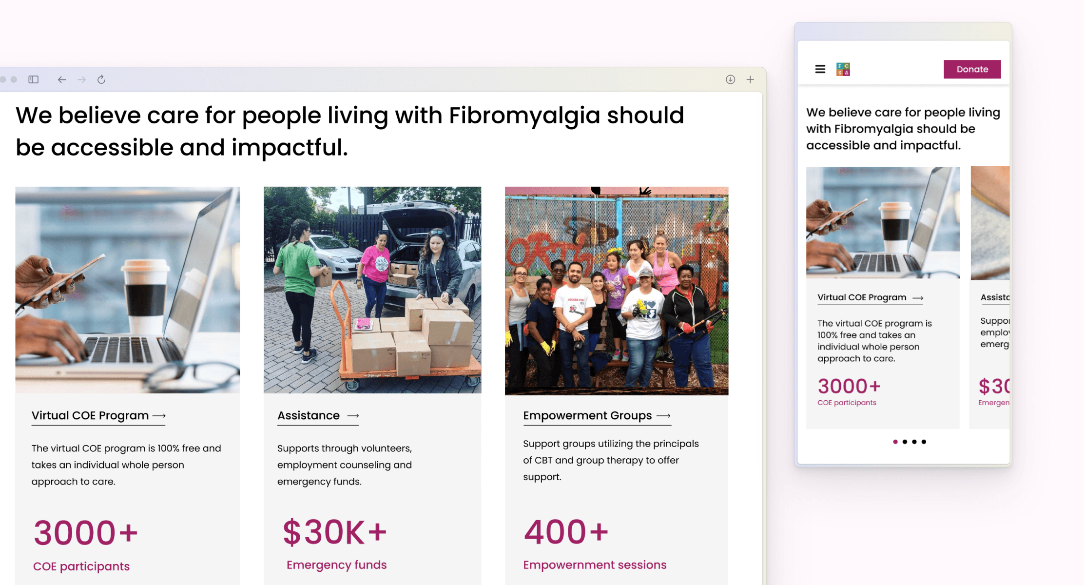
In one of our ideations, we proposed an "Impact" section, refining it through low-fidelity wireframes as we iterate on our designs, with the aim of merging it seamlessly with the "Services" section.
Iterating the Impact section.
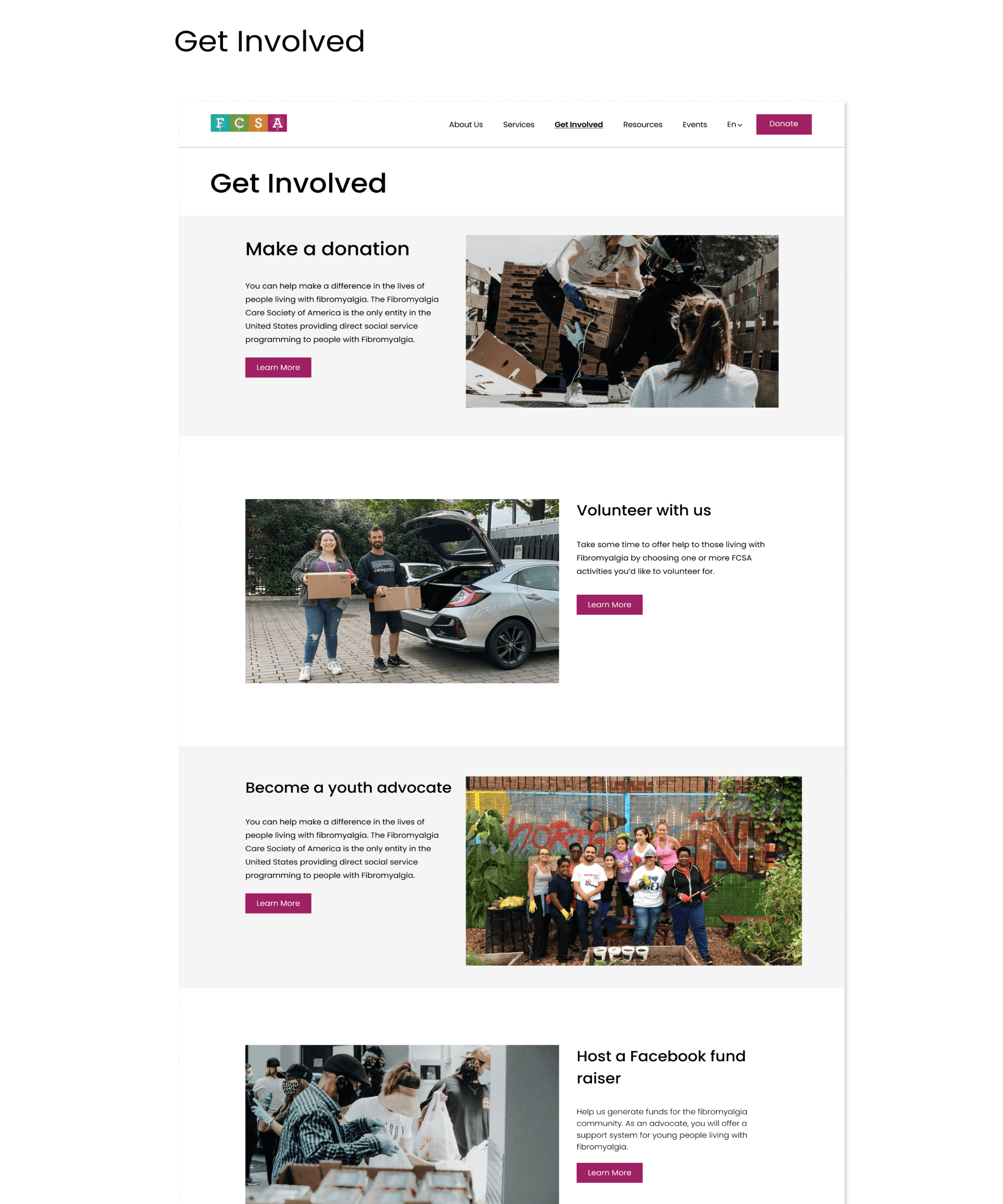
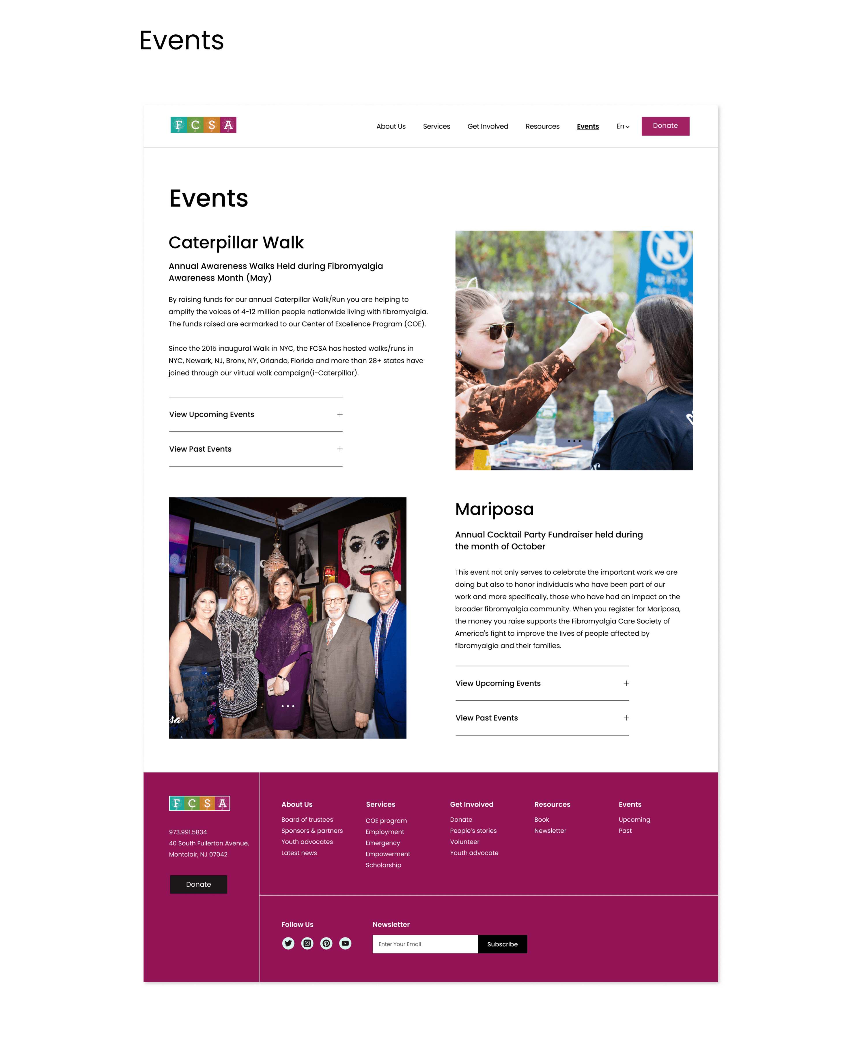
Final Designs
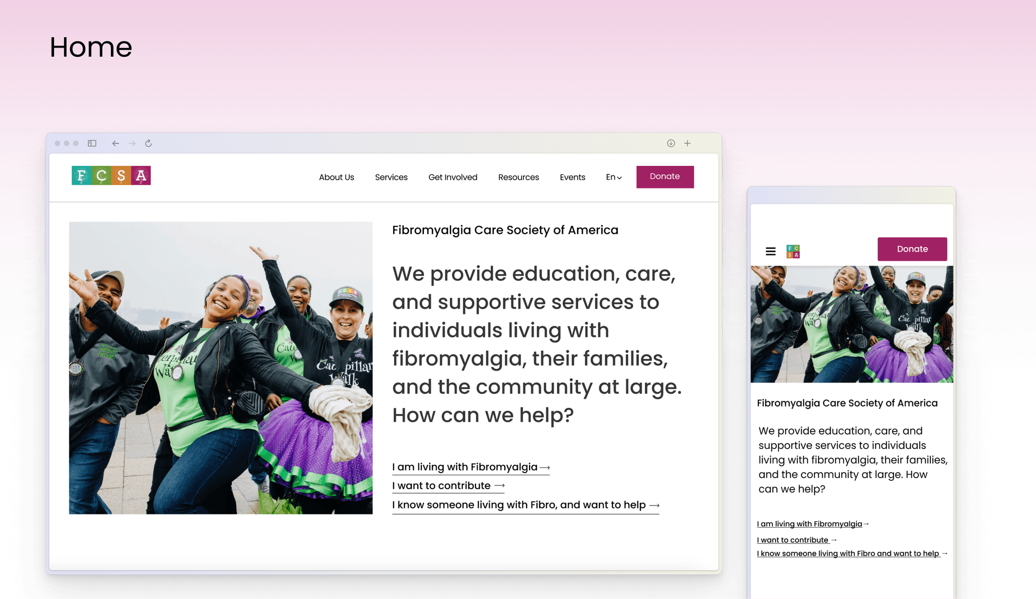
Simplified 'I" sentences for easy wayfinding.
Descriptive links in the form of 'I sentences shorten users journeys to relevant areas from the homepage.
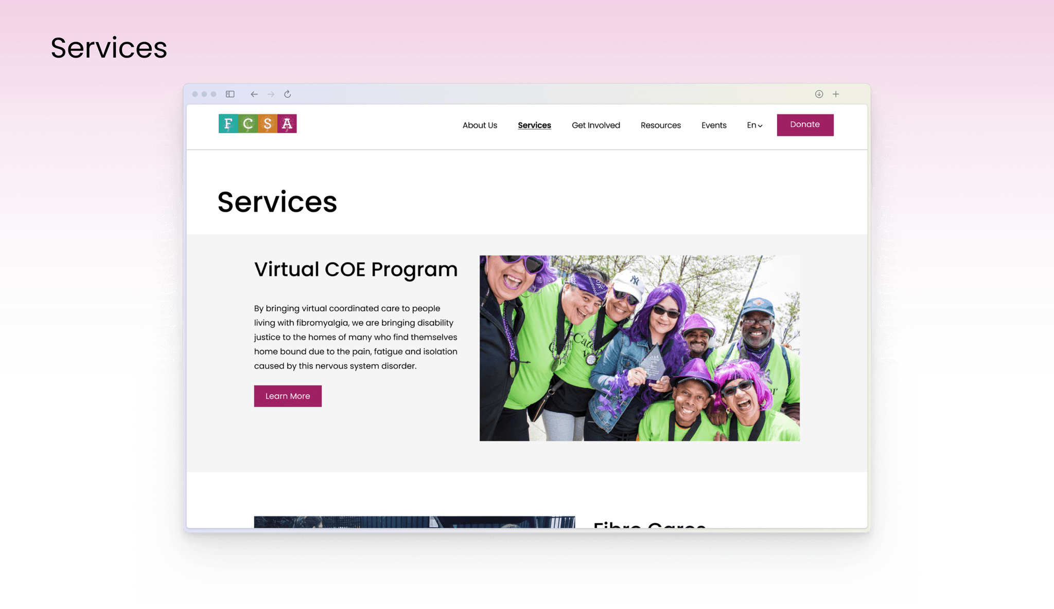
Showcasing community strength through an 'Impact Section'
An Impact Section highlights the FCSA's contributions and encourages engagement with Services.
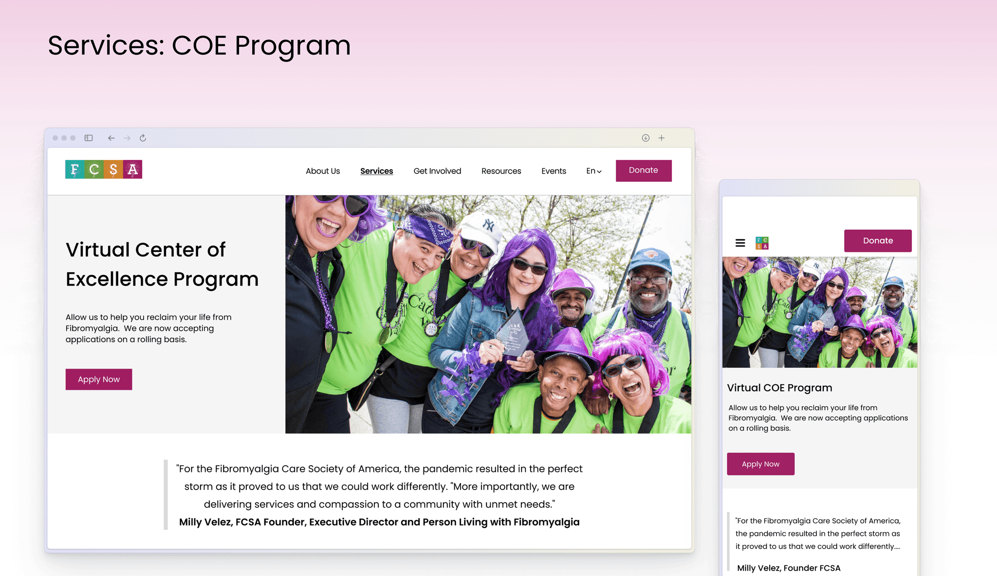
Easy access to actions from hero sections and engaging imagery.
Calls-To-Action within Hero sections of key areas enable users to take action effortlessly while incorporating imagery that resonates with people.
Interact with the prototype.
Hand-off
Delivering a website that is now more accessible and beyond..
We presented our design to the client and provided documentation for seamless implementation. The client valued our redesign and the project is currently under implementation. With improved accessibility and an enhanced user experience, the FCSA website can now serve a broader user base, including those with Fibromyalgia.
"As someone with Fibro, I can see how these changes will have a positive impact"
- Milly Velez, Founder of FCSA.
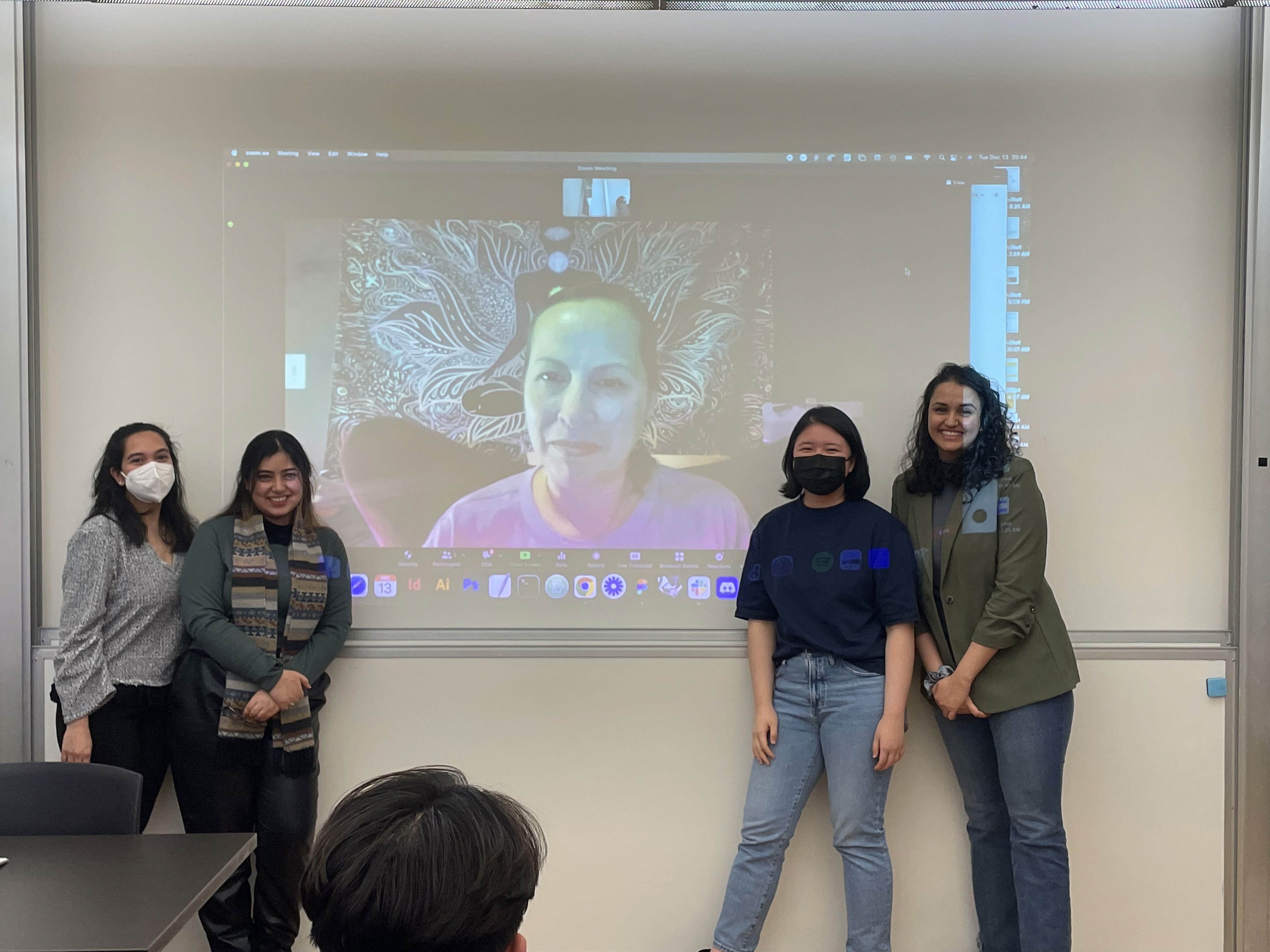
Our team with the founder.
Reflections
Understanding accessibility
Reflecting on accessibility, I've come to understand the critical importance of integrating it from the outset of the design process, as we did with this redesign project. This approach enabled us to maintain a focus on accessibility throughout the creation of the information architecture, style guide, and other aspects of the website, an approach I hope to bring in future projects as well.
Lessons from the past and for the future
From designing accessible buildings to designing an accessible website, this project was evidence of my transition as a designer. This experience deepened my appreciation for the vital role of empathy in digital design and reinforced the importance of catering to the diverse needs of all users.
