Pulse Design System
Transforming Aetna's Digital Experience.
Overview
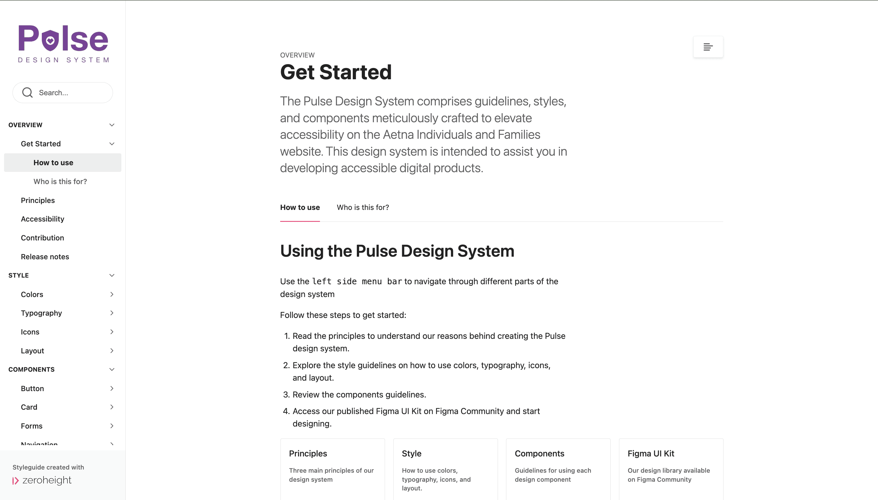
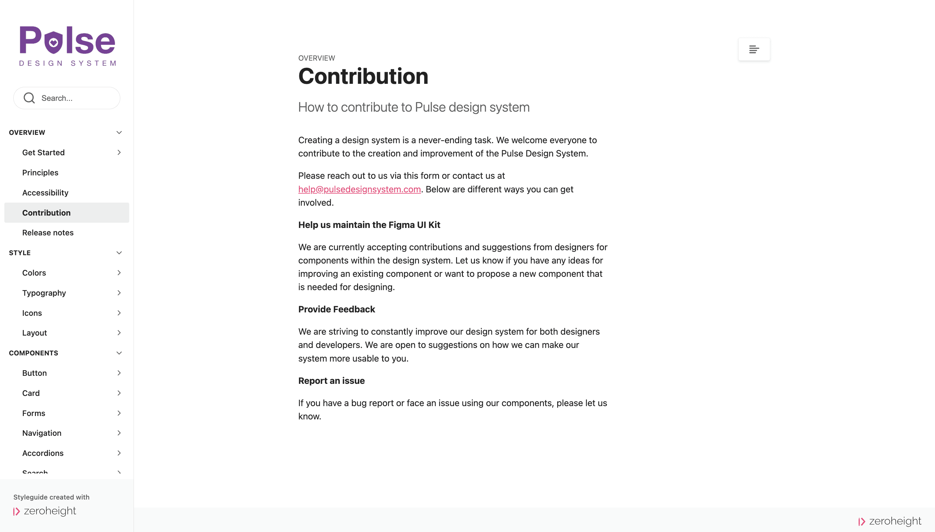
To study design systems, our team of students at Pratt undertook the project of building one from scratch. We identified the Aetna Individuals and Families website as a candidate. We created an unofficial design system for the Aetna Individuals and Families website - The Pulse Design system, which included comprehensive styles and components in a UI Kit. We also created documentation for seamless adoption by designers and developers.
Team
3 UX Designers
Project Duration
8 weeks (Fall 2023)
Tools
Figma, Google Docs, ZeroHeight
The Problem
Despite the existing Anatomy design system, the Aetna website revealed inconsistencies and redundancies throughout.
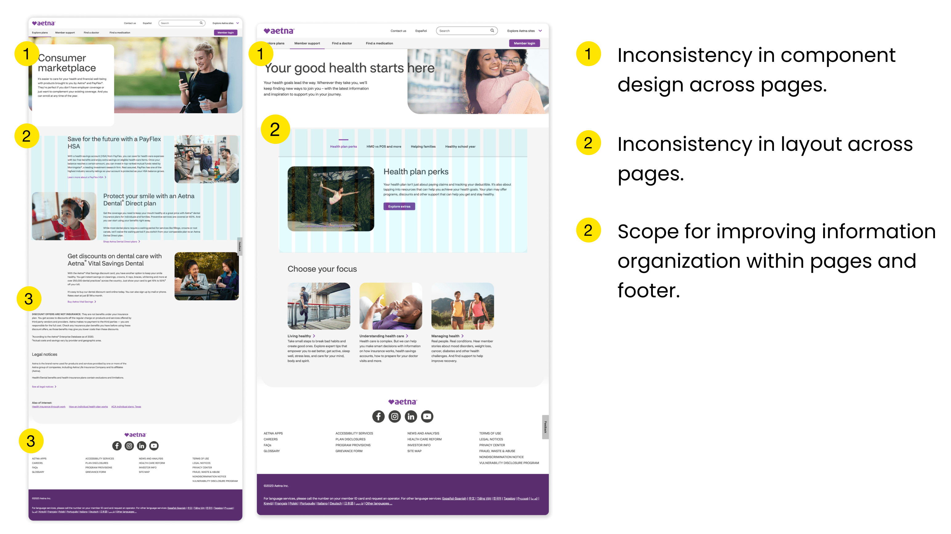
Aetna is a healthcare insurance company that offers a range of health insurance plans and related services. At first glance, the Aetna Individuals and Families website looked polished, but upon closer inspection through a UI audit, it was clear that there were significant design inconsistencies throughout.
Consistency and accessibility issues identified on the Aetna website.
The Solution
We created the Pulse Design System that was easy-to-adopt and catered to the specific needs of the Aetna website.
Guiding Principles
Our team brainstormed ideas that we valued as individuals and for our common vision for Aetna's design system. From there, we established principles to guide our design decisions.
Simplicity
We prioritized clarity and simplicity in both the form and function of each design element and the design system as a whole, making it easy for designers to adopt.
Accessibility
To ensure the accessibility of each element within the design system, we adhered to the WCAG 2.2 guidelines with the goal to create an accessible website for users.
Inclusivity
At the heart of our design system is a commitment to accommodating the diverse needs of our users, ensuring that all users feel seen and empowered through the design system.
Defining Foundations
Our first step was to lay the foundations of our design system, focusing on streamlining the existing styles. Designers could use these foundations to create new components and expand the design system further.
Typography
Ensuring visual hierarchy through defined font styles, sizes and weight.
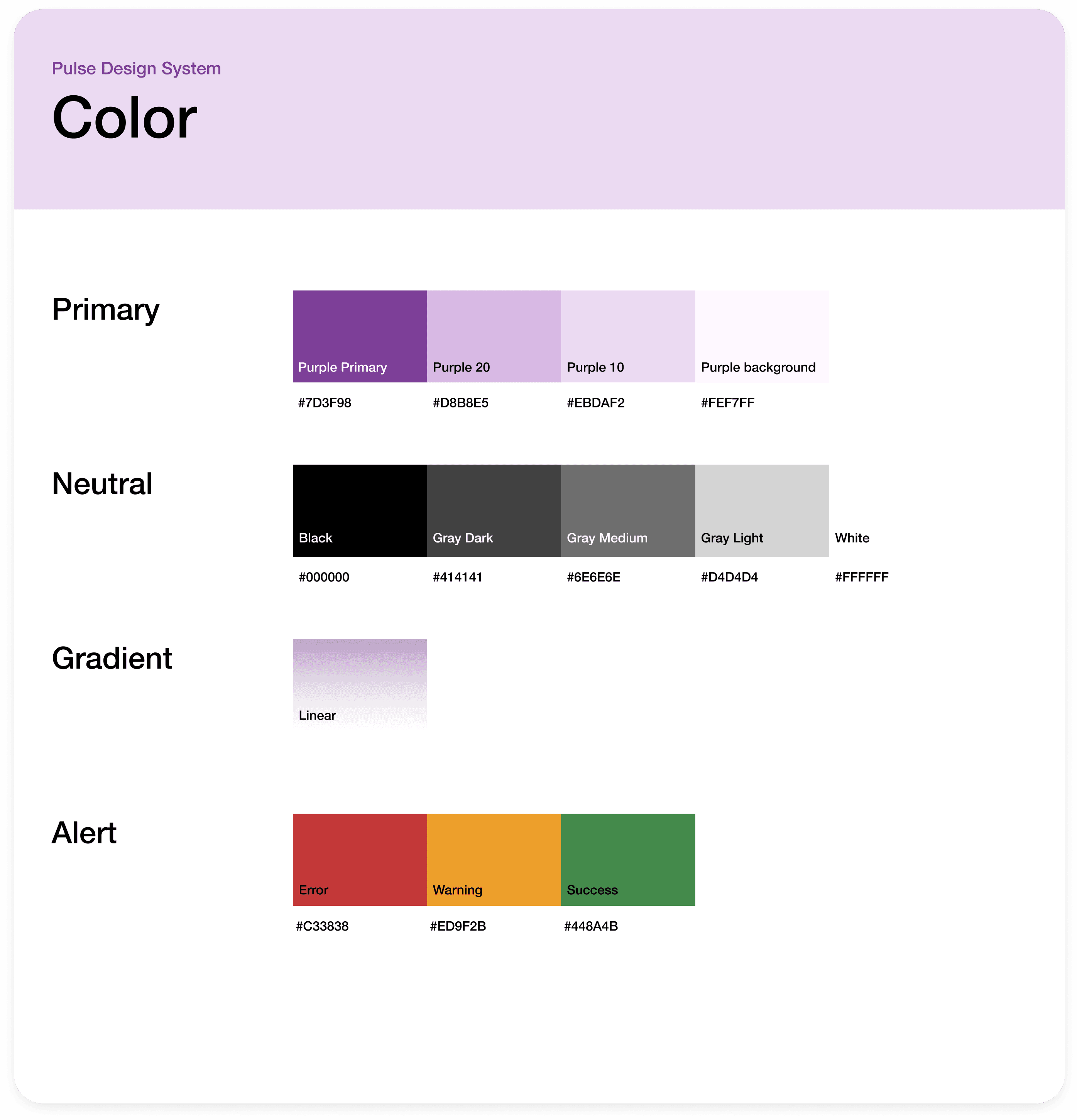
Colors
Creating a library of primary, neutral and
alert color styles that maintain contrast ratios.
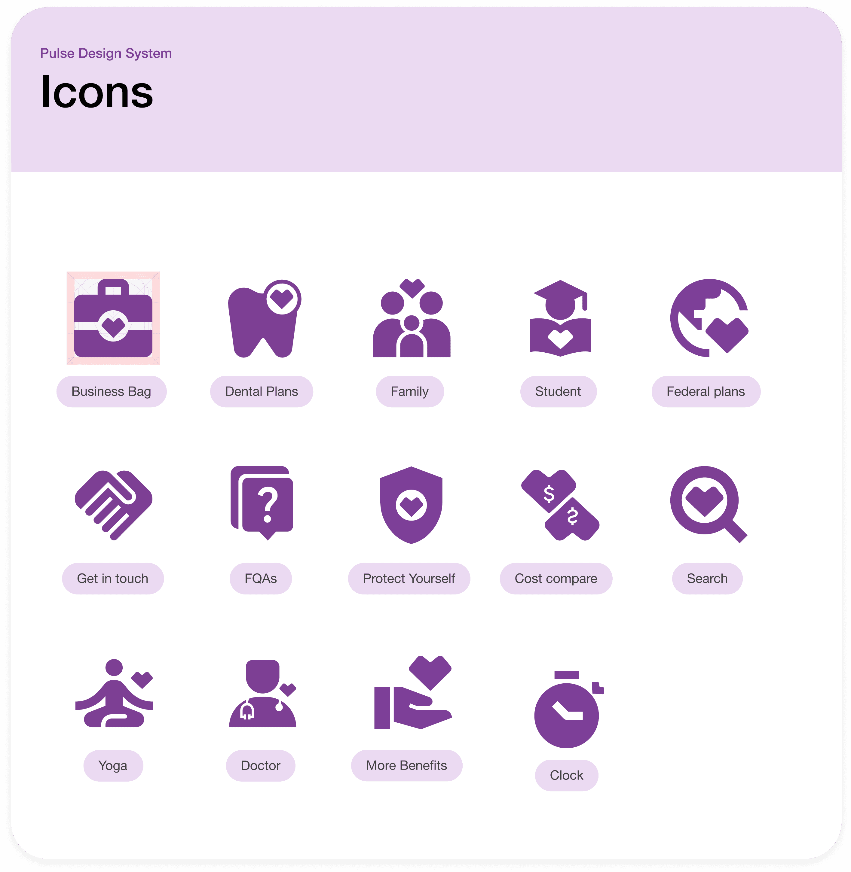
Icons
Creating accessible and inclusive icons by ensuring sufficient contrast and simplicity.
Layouts
Ensuring visual consistency and
enhanced readability through a 12 column grid.
Creating Components
Atoms: Buttons, Links and Tabs
We enhanced components for improved accessibility and visual cohesiveness. Creating a sustainable system also meant retaining existing components that worked well for the system.
Buttons and Links from Pulse Design System
Molecules: Cards and Navigational Elements
We simplified our components by removing redundancies, such as reducing the number of cards based on function and creating variants with both button and button-less options. Allowing for these functional variants enables the users of the system to customize them according to their needs.
Cards from Pulse Design System
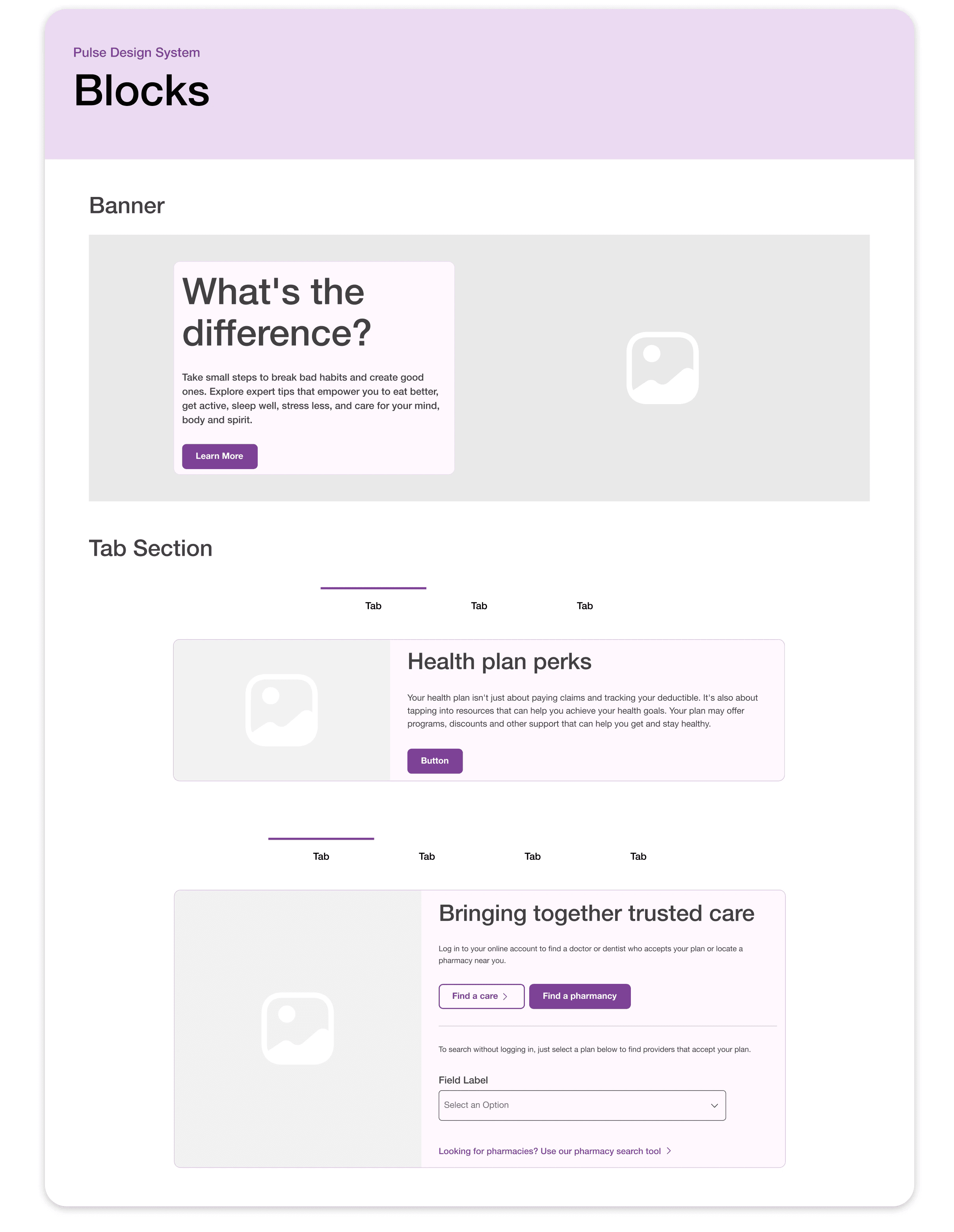
Organisms: Blocks
These reusable design elements serve specific functions consistently across the website, providing a unified experience for users and ensuring efficiency for designers.
Blocks from Pulse Design System
Pulse in action
These components serve as the building blocks for a more consistent and accessible Aetna website.
Conclusion
While this concludes the creation of Pulse, its story is not over yet...
A design system is dynamic, evolving continuously to meet the needs of its users. Although our project has concluded, our team aspires to update the UI Kit and documentation based on feedback we receive from users of Pulse.
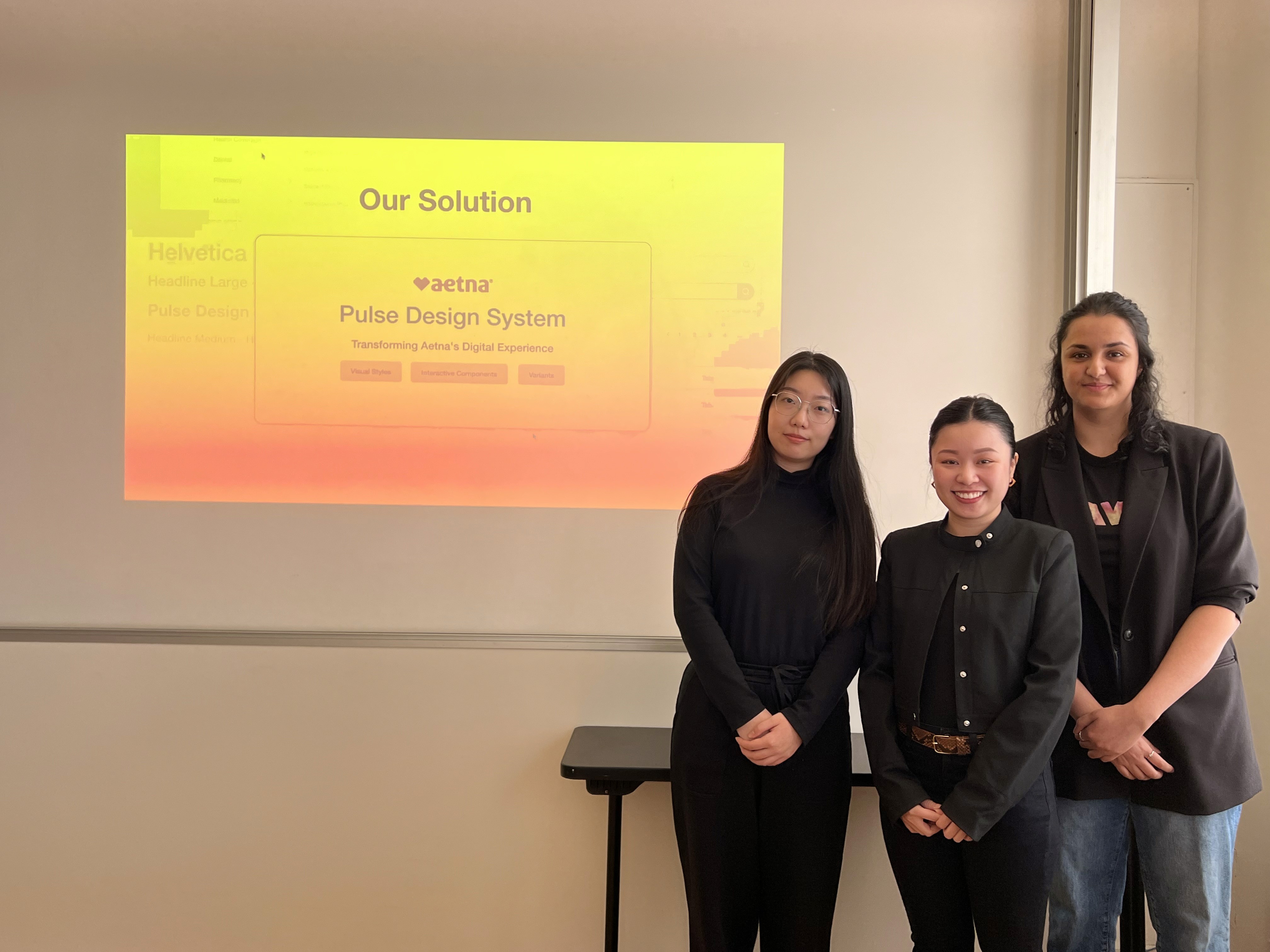
Pulse Design System Team.
Reflections
Importance of design tools and potential for research.
This project provided an opportunity to enhance skills using design tool features such as components, variants, and auto-layout to create elements. Looking ahead, I aim to delve deeper into tokens and variables and their use in design systems.
I would also like to conduct a usability study on the Pulse Design System to explore potential areas for improvement. I am also curious to learn about the long-term maintenance of a design system. I hope to have the opportunity to delve into this aspect in the future.

